SelectRight

SelectRight

SelectRight

Redesigning AI-powered university discovery

Redesigning AI-powered university discovery

Redesigning AI-powered university discovery

Product Design

UX/UI

Interaction Design

GradRight

GradRight

Business Goals

Turn AI recommendations into more confident student decisions. ultimately increasing lead capture and university shortlisting.

The existing experience generated recommendations, but students still had to navigate dense information and multiple decision points before taking meaningful action.

Content
Content
Content
Content

01. ONBOARDING

01. ONBOARDING

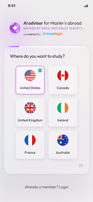
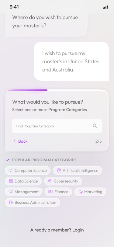
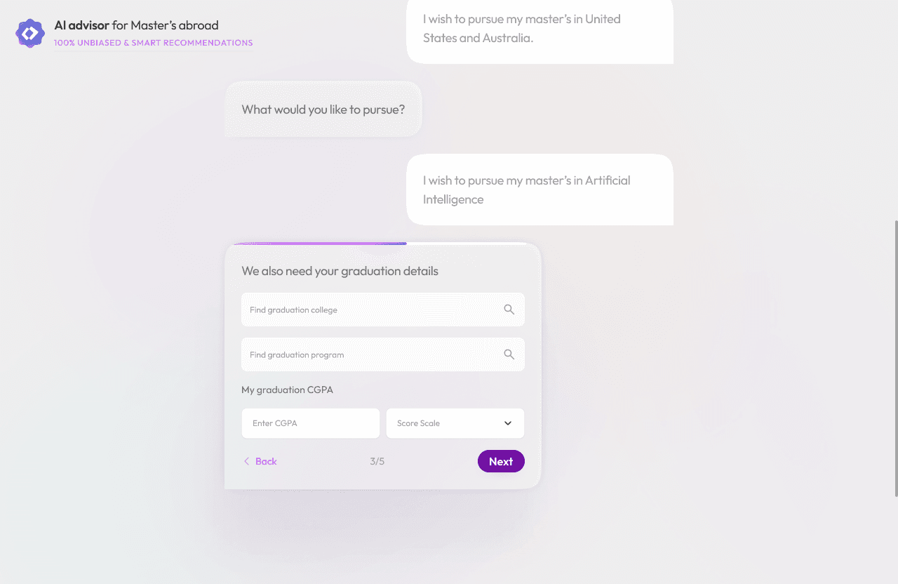
From forms to a guided experience.

Scrolling content
Scrolling content
Scrolling content
Scrolling content

GUIDED ONBOARDING

A conversational flow that captures a student’s study preferences, academic profile, and goals to power personalised university recommendations.

Why change it?

Why change it?

The existing onboarding relied on a long, form-like flow that created friction before students reached their recommendations.

The existing onboarding relied on a long, form-like flow that created friction before students reached their recommendations.

What I Changed

Short, progressive questions help students build their profile with less cognitive load.

Why change it?

The existing onboarding relied on a long, form-like flow that created friction before students reached their recommendations.

What I Changed

Short, progressive questions help students build their profile with less cognitive load.

Loading…
Loading…

INTERACTIVE ONBOARD JOURNEY

FINAL ONBOARDING SCREENS

Outcome

Less friction → more completed profiles → more users reaching AI recommendations.

02. AI Recommendations

02. AI Recommendations

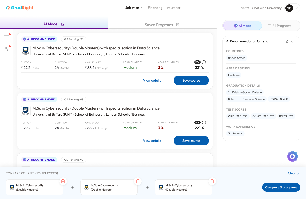
From university lists to smarter decisions.

Surfacing the information students need to compare and shortlist.

BEFORE

BEFORE

AFTER

AFTER

selectright.com
AfterBefore

Why change it?

Why change it?

Recommendations alone weren't enough. Students needed to quickly understand why a university matched their profile and whether it was worth considering.

Recommendations alone weren't enough. Students needed to quickly understand why a university matched their profile and whether it was worth considering.

What I Changed

Short, progressive questions help students build their profile with less cognitive load.

Why change it?

The existing onboarding relied on a long, form-like flow that created friction before students reached their recommendations.

What I Changed

I reorganized the recommendation experience around the decision-making signals students care about:

AI Match · Admission Chance · ROI · Loan Chance · Compare

AfterBefore
AfterBefore
Before
After

Drag the slider to compare before and after side-by-side.

The Changes

The Changes

The Changes

The Changes

Clarified action hierarchy

Established Save as the primary action and View Details as the secondary path.

Reduced visual noise

Replaced the dominant admission indicator with a more balanced information hierarchy.

Replaced the dominant admission indicator with a more balanced information hierarchy.

Made recommendations explainable

Kept the student's recommendation criteria visible alongside AI-generated results.

Designed for comparison

Kept the student's recommendation criteria visible alongside AI-generated results.

Outcome

Better information hierarchy → faster comparison → stronger shortlisting intent.

03. Program Details

03. Program Details

Making complex information easier to scan.

A structured hierarchy brings the most important program information forward.

BEFORE

BEFORE

AFTER

AFTER

selectright.com
AfterBefore

Why change it?

Why change it?

Important program information was distributed across the experience, making it harder for students to evaluate an option confidently.

Important program information was distributed across the experience, making it harder for students to evaluate an option confidently.

What I Changed

Short, progressive questions help students build their profile with less cognitive load.

Why change it?

The existing onboarding relied on a long, form-like flow that created friction before students reached their recommendations.

What I Changed

A clearer hierarchy brings decision-critical information forward while making secondary information easier to access.

AfterBefore
AfterBefore
Before
After

Drag the slider to compare before and after side-by-side.

The Changes

The Changes

The Changes

The Changes

Cleaned up the hierarchy

Made the whole page more structured and easier to scan.

Brought important info up front

Fees, duration, acceptance rate, ROI, rankings and deadlines are now easier to spot.

Fees, duration, acceptance rate, ROI, rankings and deadlines are now easier to spot.

Grouped things better

Broke the long page into clear sections and cards so it doesn’t feel like one big block of information.

Made the overall experience lighter

Improved spacing, consistency and layout so users can find what they need without digging through the page.

Customized header for each Universities program details.

Customized header for each Universities program details.

Outcome

Better information hierarchy → faster comparison → stronger shortlisting intent.

~2×

Higher shortlist conversion

Organic users vs. inorganic users

1.49% organic

0.76% inorganic

13.66%

Users regenerated recommendations

112 users out of 820 who generated AI results

112 users

820 total

5×

Lead-capture improvement

Measured through the redesigned acquisition funnel

Funnel outcome

14×

Shortlisting improvement

Measured through the redesigned shortlisting funnel

Conversion outcome

04. IMPACT

04. IMPACT

A redesign measured beyond pixels.

A redesign measured beyond pixels.

A redesign measured beyond pixels.

Better discovery

clearer decisions

Stronger Conversion

Let's build it together.

Sarthak Prakash

Designer

5:40 PM

Available